So many people go now to Pinterest for a quick access to interior design. I am one of the many. I find it relaxing to go from one design idea to another and imagine my space looking the same. It’s also my own way of knowing the current trends and the different aspects that make up good design. Through endless browsing, I realized one thing the most: aesthetics is not just pleasing to the eyes, it also paves the way for a smooth and organized living.
It’s warming to see personal effects in small clusters because it makes a space have a sense of residence, a proof that it can be lived in. But there is also a major perk with having a clean and beautiful space, peace of mind, and clarity. Moreover, when you maintain the cleanliness of your space, you wouldn’t have to rush tidying up whenever family and friends would come to visit. It is already presentable.
Personally, I choose a color theme first when I’m about to redecorate. Following a color palette eases up the process of picking pieces that would go together for the space. Mixing paint also presents an adventure to me as I do not know what it would look like on the walls before I paint on them. I like how unpredictable yet still stylish and holistic it looks like in the end.
It’s hard to achieve color coordination, matching, arranging, and designing colors in a way that they would look satisfying and well-put-together. Familiarity with the color wheel is a must, wherein you could see what will come out from the mixture of primary, secondary, and tertiary colors.
Red, yellow, and blue is the primary colors. When you mix the primary colors, you’ll get the tertiary colors. Red plus yellow is orange; blue plus yellow is green, and red plus blue is violet.
To complete the six tertiary colors, you add primary and secondary colors together. To name a few, these are red-orange, yellow-orange, yellow-green, blue-green, blue-violet, and red-violet.
You can mix and match colors without a miss when you use the color wheel in particular ways. We listed down a few below:
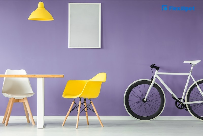
1. Complimentary or contrasting combination.
Look at the color wheel and the two colors opposite of each other. The combination of these two contrasting colors will energize anyone who walks into the space, more especially if you set them at maximum saturation or darkness.
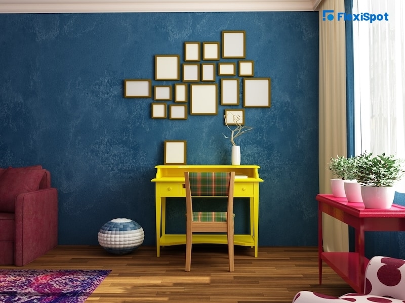
2. Triad combination.
There will be colors in the color wheel that form a triangle, these colors are said to be equidistant to each other. Like the first color combo mentioned, this is also high in contrast and preserves harmony. Whatever opacity you choose, it will have a vibrant finish.
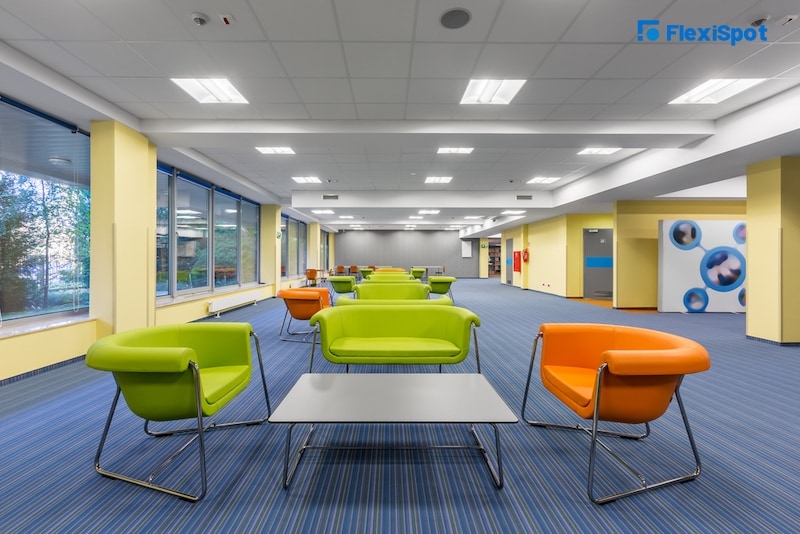
3. Analogous.
When you combine 2 to 5 or 2 to 3 colors beside one other on the color wheel, you achieve an analogous color combination, creating an environment that is aesthetically pleasing and calming. Even if you choose muted versions of the colors in the wheel, it would still look very much the same.
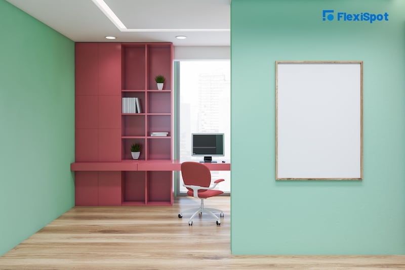
4. Split complementary color combination.
Similar to a complementary combination, the colors in this combo also form a triangle, although instead of being equilateral, it looks more obtuse. Combine one primary color with two of the colors directly on the left and right sides of the complementary color to the primary ones you have chosen.
That might sound like word vomit so here’s an example. If you choose the primary color red, the opposite of it is green in the color wheel which is the complementary color for red. But if we want to determine the split-complementary color for red, then check the left and right sides of the green, and you’ll get blue-green and yellow-green. The effects of these combos are less intense than the complementary combination.
5. Tetrad combination.
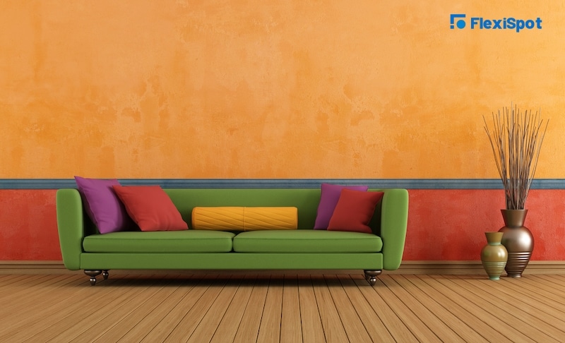
You find out this color when you look at a rectangular shape inside the color wheel. How do you spot a rectangle in a circle? Pick two colors opposite each other in the wheel and then combine the colors on the left and right sides of each color you chose. This creates the rectangular shape and the tetrad combination.
6. Square combination.
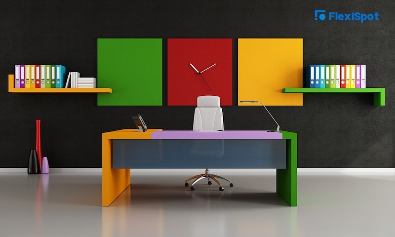
Get four colors on equal sides of the color wheel. When combined, these colors will create vivid and dynamic effects that look different in tone but still complement one another. Take for example this combination of red, blue-purple, green, and yellow-orange. If you don’t fancy too dark colors for your space, you can always play with the intensity or opaqueness of the color.